Tuesday, 29 September 2015

THE GOOD BAD AND UGLY


The Good, the Bad and the Ugly  is a 1966 Italian Western film. we were all asked to re-create a scene from the movie . The scene was a shoot out between three guys (the good the bad and the ugly). our task was to use different camera angles ( long shots,closeup,mid-shot ) to re create the scene.

Camera angles

We've used ;

long shot
which shows a scene from a distance. A long shot is used to show the environment or setting of a scene.

Over the Shoulder Shot
Over the Shoulder Shot framed from behind a person who is looking at the subject.This shot helps to see the position of each person, and see one person from the other's point of view.

Medium shot
Which is a shot that frames actors from the waist up.mid shot shows some part of the subject in more detail. Its is used to show the actors reaction . Ii is appropriate when the subject is speaking less emotion or having a conversation.

Close-up
Is a shot  taken close up .The close-up focuses the actor's expressions. In Close-up shot certain feature of the subject is zoomed and takes up most of the frame. Close up shot is used to show more detail.for example in this picture the close-up shot emphasizes her emotion and exaggerates her facial expression.The viewer is drawn into the subject's personal space and shares their feelings.

Two Shot
is a shot of two people. Often used in interviews, or when two presenters are hosting a show.

Monday, 21 September 2015

CAMERA SHOTS AND ANGLES

                                           
                                                                 HIGH ANGLE 


A high angle shot is usually when the camera is above the eye line looking down. high angles are usually used to show some one as powerless,vulnerable and weak.a high angle is used to do this because it looks down on the character making them appear smaller thus weaker.

CLOSE UP 


In the closeup shot, a certain feature or part of the subject takes up most of the frame. A close up of a person usually means a close up of their face.Close-ups are useful for showing detail and can also be used as a cut in.A close-up of a person emphasizes their emotional state. A close-up exaggerates facial expressions which convey emotion.The viewer is drawn into the subject's personal space and shares their feelings.

LONG SHOT 


A long shot provides an extended view of the scene around the character. It contains landscape but gives the viewer a more specific idea of setting. A long shot may show the viewers the building where the action will take place.

LOW ANGLE 


This shows the subject from below, giving them the impression of being more powerful or dominant. This can make the audience feel vulnerable and small by looking up at the character. This can help the responder feel empathy if they are viewing the frame from another character's point of view.

POINT OF VIEW SHOT 


This shot shows a view from the subject's perspective. In a POV, we appear to look through the eyes of a character, we see what they see.This technique is often used in the horror and thriller genres, to suggest someone spying on someone else, while withholding the identity of the 'spy'.

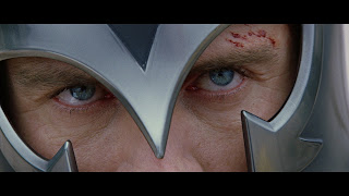
EXTREME CLOSE UP 


The extreme close up shot is traditionally used in films to allow the viewer to enter the characters intimate space,revealing certain characteristics and emotions that would otherwise would be unnoticed from far.


Saturday, 5 September 2015

MAGAZINE ANALYSIS


We were asked to analysis magazines and to write about different connotations of the different area of the front cover. All magazines have a masthead which is the top section of a magazine that includes the title. Over the masthead there is strap line  that summarizes the magazines ethos in one line. Most magazines tend to use colours that appeals to their target audience, e.g. BLISS is written in a bright pink which attracts teen girls. The magazine looks colourful and bright where as TATLER contains dark and neutral colours which appeals to older men.


Pictures are normally anchored with text that gives meaning to the picture. There are cover lines around the cover picture which tells the reader what is inside the magazine. Some magazines contain human interest stories which are melodramatic stories that are supposed to entice you to want to know more, they are usually real life stories. The stories are targeted at the target audience, e.g. BLISS focuses on stories that would appeal to young teens( "why I had a boob job at 16" ) where as TATLER talks about "Men's issues" I'm pretty sure no girl want to read about men's issues.