LABLES

Showing posts with label PRELIMINARY TASK. Show all posts

Saturday, 5 December 2015

MAGAZINE COVER ANALYSIS


MEN'S HEALTH 

MAGAZINE 

The masthead of this magazine is written in lower case and is a red font to show its simplicity. The name also gives an idea
of the target audience of the magazine which is clearly men. The cover lines clearly shows that the magazine is suited for men as it addresses different types of health tips which may be useful for men. 'STOP EXCUSAS' is a mode of address and is written in block capitals and is also highlighted.This makes it seem as if they are directly shouting at the men which are looking at the cover to encourage them to workout. Another mode of address is the man used on the front cover, which is leo rico . He is looking straight at the camera smiling.he has his top off this shows the audience how their body can change if they do what they are told on the magazine(exercise) and be as confident as him.if they had out of shape man the audience may not take the magazine seriously .'him having a ripped body also relates to mens health and portrays the ideal men body. It also makes the magazine seem like men have to look a certain way which is to have abs and that it would instantly make them sexually attractive.


WOMEN FASHION MAGAZINE 

The masthead of this mazagine is blue but its written in capital letters. This connotation makes the cover  look much more sophisticated and the fact that it is blue gives it a more classic and chic feel. One of the coverlines for Fashion magazine
is 'BEST BEAUTY INVESTMENTS' which is clearly aimed for women as stereotypically, women love 'Fashion' and looking at the new trends, so it fits perfectly with their needs. On this front cover, Miley cyrus  is being used as the model and she looks perfect  and airbrushed. She is wearing a black dress which is revealing, she isn't fully clothed,but still looks. Her hair is neat and makeup is very bold and sharp, which suggests that women are not just sex  objects even if they aren't covered up properly, they can still look elegant and fashionable rather than trashy. 

Thursday, 8 October 2015

CONTENT PAGE examples


FINAL PRODUCT


HERE IS MY FINAL PRODUCT ......


THE MAKING.....


Here is how i started. well first i opened photo shop ( blank A4 page ) then i had to adjust my main image so that i have enough space for the masthead and headlines. then i edited the the name of the magazine.i used  black and white writing color  because i wanted my student model to be the main focus and i didn't want the front cover to look colorful,i wanted it to look simple but catchy.


then all i did is add a bar code at the end of the page and add text. The barcode helps to show the audience that it is a magazine. i used color boxes to make sure the texts are visible and stand out so that the reader can clearly see what the magazine contains.I made sure that the texts are inline and looks good.

TOP 3 IMAGES CHOSEN FOR FROINT COVER


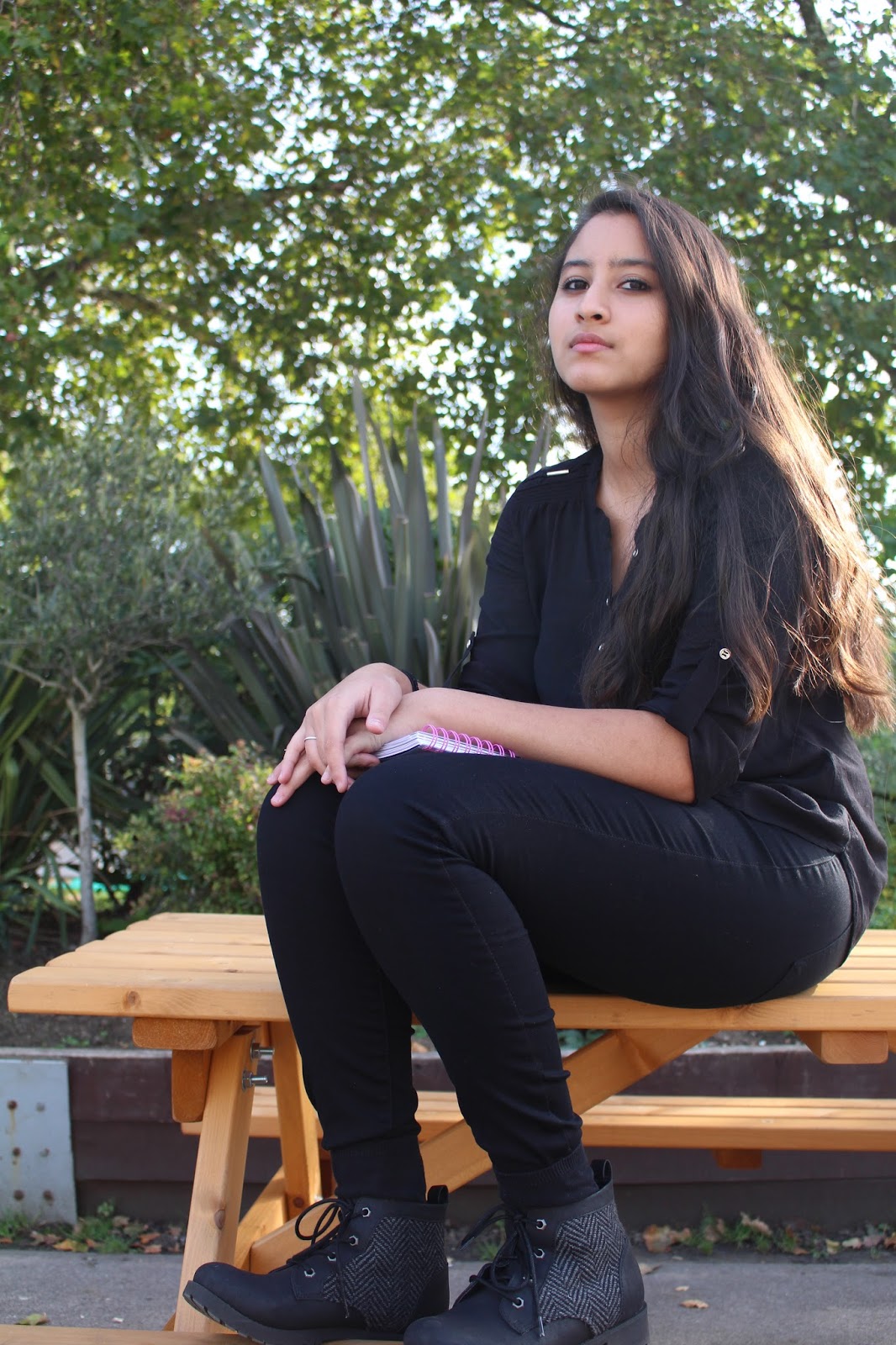
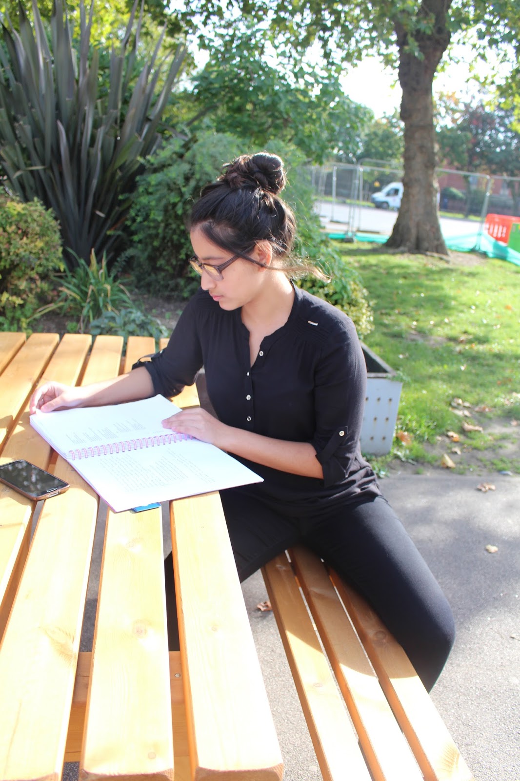
Here the image looks large and my model is the main attention this attracts the customer they can clearly see she is a students as she has an exercise book and a pen. the image is direct mode of address  my model is looking directly at the camera. the direct gaze helps stimulate  interaction with each individual reader 


This  image is taken LOW ANGLE. The angle makes my model look more powerful and confident .I feel this image is  appropriate for a school magazine the model is holding a notepad , however i wish i used a brighter lighting , I ll make sure to make it more brighter when editing, hopefully through editing i can make the image look better.


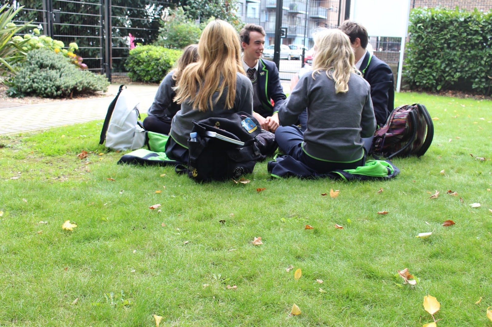
 I wanted to take a image of students working together to show knowledge being shared between students, this image was taken candid snapshot, i thought it was better to take it this ay because i didn't want the image to look forced and unrealistic.

IMAGES FOR FRONT COVER


TOP 3 FONTS


I chosen the name HAGGY-WEEKLY for the School magazine as its catchy and rhymes which makes it more exciting. The first and second font are quite similar as they are bold and have a black background. The first one looks like graffiti writing which can often be related to school and artwork. The second font looks similar to the first, but looks less graffiti and looks quite simple and appropriate for a school magazine. The third font is more simple and the letter are not quite inline and the letters aren't properly placed so it makes the magazine seem more entertaining.


FONT IDEAS FOR SCHOOL MAGAZINE


Tuesday, 29 September 2015

THE GOOD BAD AND UGLY


The Good, the Bad and the Ugly  is a 1966 Italian Western film. we were all asked to re-create a scene from the movie . The scene was a shoot out between three guys (the good the bad and the ugly). our task was to use different camera angles ( long shots,closeup,mid-shot ) to re create the scene.

Camera angles

We've used ;

long shot
which shows a scene from a distance. A long shot is used to show the environment or setting of a scene.

Over the Shoulder Shot
Over the Shoulder Shot framed from behind a person who is looking at the subject.This shot helps to see the position of each person, and see one person from the other's point of view.

Medium shot
Which is a shot that frames actors from the waist up.mid shot shows some part of the subject in more detail. Its is used to show the actors reaction . Ii is appropriate when the subject is speaking less emotion or having a conversation.

Close-up
Is a shot  taken close up .The close-up focuses the actor's expressions. In Close-up shot certain feature of the subject is zoomed and takes up most of the frame. Close up shot is used to show more detail.for example in this picture the close-up shot emphasizes her emotion and exaggerates her facial expression.The viewer is drawn into the subject's personal space and shares their feelings.

Two Shot
is a shot of two people. Often used in interviews, or when two presenters are hosting a show.