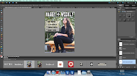
Here is how i started. well first i opened photo shop ( blank A4 page ) then i had to adjust my main image so that i have enough space for the masthead and headlines. then i edited the the name of the magazine.i used black and white writing color because i wanted my student model to be the main focus and i didn't want the front cover to look colorful,i wanted it to look simple but catchy.


then all i did is add a bar code at the end of the page and add text. The barcode helps to show the audience that it is a magazine. i used color boxes to make sure the texts are visible and stand out so that the reader can clearly see what the magazine contains.I made sure that the texts are inline and looks good.


No comments:
Post a Comment