Wednesday, 27 April 2016
Monday, 18 April 2016
TO DO LIST FOR NEXT LESSON
- NEXT LESSON i will make the double page spread
- I have planned the page and i know how i want it to look i just need to pit it on photoshop and edit the page
- Quicktime record while doing to show step by step making of the page
- Photoshoot for the background texture
- Select images
- Write article
CHAGES TO CONTENT PAGE
Ive changed the background to match it with my front cover. I've also changed the position of the images to make it fit on to the page. I added text box so that my audience can see and read the text more clearly.
CONTENT PAGE UPDATE
HERE IS WHERE I AM RIGHT NOW. I ll be making some changes to the page as its not quite how i want it to look. i might make changes to the possession of the images. I haven't decided where to put them yet.
Tuesday, 12 April 2016
Monday, 11 April 2016
MAKING OF THE CONTENT PAGE
I have started creating my content page.
Experimenting with different fonts, I decided to use the font below from
'Dafont' this will be my font i will use. I have decided to keep it black and
not add any other colours to keep it simple and attractive.
I started placing the images where I wanted them. I
used one photo as a background. i chose this photo because its floral and looks
very attractive as a background. I changed the capacity of the image so that
the background doesn’t look too bold as I don't want it to be the main
focus.
I then started placing the images where I wanted them.
I placed 4 images and used one photo as a background. i then added boxes on the
side of the images so that I can add text on the image. I coloured the boxes
white and changed the capacity so that the whole image is visible. I then added
texts. I mainly used red and black text colours as it’s my colour scheme. The
front page has red and black so I decided to match my content page to the front
cover . HERE IS HOW IT LOOKS.....
Conventions of content pages
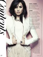

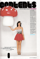
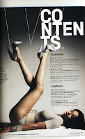
- Main Image; The main image on the contents page is the most important story in the magazine. It is usually positioned in the middle or towards the side of the page. It is framed by the rest of the text.
- Issue number; Most of the time positioned in the top left or right corner of the contents page.
- Quotes; Sometimes contents pages have quotes from interviews they had done in the magazine. this helps to grab the audiences attention.Most of the time they are on the main image.
- Layout; The contents is laid out into 3 or 4 columns, they are to the side of the main image. They never overlap or cover the image.
- Font; Usually in size 11pt and big bold font of the ‘contents’ title in placed at the top.
- Front cover; In some contents pages they have a small copy of the magazine front cover, they put page numbers in circles to show which story is on which page. This makes it quicker for the audience to locate the page they want.
- Contents; Word is prominent, it lets the audience know it is actually the contents page where they can find out more details. Written in bold, capitals, also the colour (white) contrasts against the black background. This makes it stand out to the audience.
FINAL PRODUCT - FRONT PAGE
Here is my final product.....
The image is quite colour full and vibrant because the colour gives my magazine a Bollywood theme as Bollywood is well known for its bright and vibrant colours. i decided to use a white background because the models sari(dress) contrasts with the whits background thus making my model the main focus.just white background looked quite plain so i added colourful shapes in the background but i had to change the capacity and experiment with different colours to make sure the model is the main focus. I wanted to stick to it as a consistent theme throughout the magazine, including the doublespread. I'm going to use coloured pictures in my contents page and double page spread to stick to it as a consistent theme. Colourful image and background gives it happy exciting feel, to relate to the idea of my magazine being Bollywood.
I chose the name 'PRIYA CHOPRA' for the girls on my cover as the name is very indian , and the name is a well known indian name giving my audience a clue the its a Bollywood magazine .
I made up the articles on the cover and I thought they would be very suitable. The 'EXCLUSIVE INTERVIEW ' article is something I tend to see on lots of magazines because people love to read interviews of celebrities . 'Top 10' shows the best music in the current charts which will help my audience discover new songs and briefly expand their knowledge of indian music.
MAKING OF THE FRONT COVER
Today in lesson i started making my front cover. i started with opening an A4 page on Photoshop. I choose an image that is appropriate and attractive.
I then had to adjust the size of the image to fit my page. the background was plain white and did not look creative at all so i decided to change the background. I added colourful triangles and stretched them to create a colourful background. after cutting the image, the edges looked quit sharp and amature so I created a layer of the image, change the capacity and then place it under the real image to create a smoother edge.
I then added a title to the cover.I started by playing with font and found a font on 'Dafont' this will be my background against the colour that I will decide to do in the end, the text wont be so harsh, it will barely show up as I don't want the main focus on the text but rather the image and mast head and i will also place the text behind the image to make the image the main focus rather than the text.
Experimenting with different colours and backgrounds, I decided to keep a white background with colourful triangles to add a little creativity to the page.lack the texts around the image are red and black which isn't too loud and perfectly compliments the genre Bollywood .
FRONT COVER PHOTO

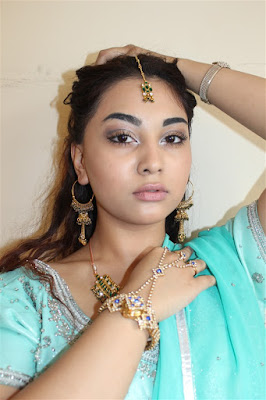
After conducting a survey of target audience I have come to a conclusion to use this mid shot photo for my front cover. The medium shot is the most common shot used in music magazine front covers. Every shot that isn't a long shot or close up is a medium shot. a mid shot contains the characters or a character from the waist up. From this shot, viewers can see the characters' faces more clearly . i have chosen to use a mid shot photo of my model because the photo will make the audience focus on the model and understand their significance within their music career.the mid shot clearly shows the models expressions while still showing the white background.
The lighting and the colour contrast is very effective and good because the the clothing colour of the model contrasts with the white background again making the model the main focus.the lighting makes jewellery more shiny and new which can represent the rising of a new star (artist). the lighting emphasises the make of my model making it look more brighter and smooth.
I have edited the image to make it more brighter and more appealing to my audience . i have airbrushed my model slightly as most magazine cover models are airbrushed making the models look much more slimmer and more appealing to then target audience. however i haven't edited the image too much to give my model a natural look.
Sunday, 10 April 2016
FINAL PHOTOSHOOT PLANANING
Location: Haggerston school sports hall , London, England, United Kingdom
Take photos for my content page and double page spread
Different angle shots
Time approx: 2pm- 8pm
Model: VISHAKI , TORAL, MOONISHA , SMIT
Model: VISHAKI , TORAL, MOONISHA , SMIT
Cameras used: Nikon D3000 18-55 VR Kit
D3000 AF-S DX NIKKOR 18-55mm f/3.5-5.6G VR
Canon EOS 600D Digital SLR + 18-55mm DC III Lens
Canon zoom lens ef-s 18-55mm 1:3.5-5.6
FONT SELECTION
Here are some of the font i have chosen to use. I his fonts are appropriate for my mast head as they are all very bold. I have decided to use the top font.
Saturday, 9 April 2016
BEFORE AND AFTER EDITS OF FEW PHOTOS
Today i edited few of my photos using CYBER PHOTO DIRECTOR. In all my images I have experimented with the contrast and exposure and made the colour balance more vivid, the reason for this is to make my photos look more loud and less washed out. here are some of the before and after edits I have shown the difference after editing the images and colour correction, and as you can see the difference is immense.
Here I changed the lighting of my photo making it more brighter and vibrant. The vibrancy makes my model look much more younger and healthy, therefore artificial lighting when there is a lack of natural lighting makes a huge difference. I've also slightly changed my models look by making her face slimmer and her eyes bigger. I added glow to her face and shine to her hair to make it stand out more and look attractive. I've also air brushed my model to give her a typical celebrity look. .
Here I have tested the focus of the camera by doing a close-up of my models face, to emphasize this I edited the image and made the background blurred to make the models face stand out.
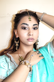

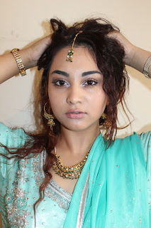
I made my model look much more slimmer. I've also added glow and light to her face to make her look much more younger, healthy and attractive . i made my model wear lots of jewellery as its tradition in Bollywood and most Bollywood celebrities wear lots of jewellery. i wanted her face and the jewellery to be the main focus in this photo and stood out from the background , making her stand out on a whole and the white around contrast with her clothing and jewellery. I purposely decided to do this, as the main focus of the image is my model, however as I am doing indie rock, it was important that i bought in some nature.
Friday, 8 April 2016
PHOTO SHOOT PLANNING
Location:Geoffrey court N16rx , London, England, United Kingdom
Take photos for my front cover
Mid shot photos of my model
Time approx: 2pm- 8pm
Model: Tasima
Props used: Bracelet and Head piece
Model: Tasima
Props used: Bracelet and Head piece
Cameras used: Nikon D3000 18-55 VR Kit
D3000 AF-S DX NIKKOR 18-55mm f/3.5-5.6G VR
Canon EOS 600D Digital SLR + 18-55mm DC III Lens
Canon zoom lens ef-s 18-55mm 1:3.5-5.6
Subscribe to:
Comments (Atom)


