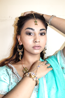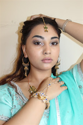

After conducting a survey of target audience I have come to a conclusion to use this mid shot photo for my front cover. The medium shot is the most common shot used in music magazine front covers. Every shot that isn't a long shot or close up is a medium shot. a mid shot contains the characters or a character from the waist up. From this shot, viewers can see the characters' faces more clearly . i have chosen to use a mid shot photo of my model because the photo will make the audience focus on the model and understand their significance within their music career.the mid shot clearly shows the models expressions while still showing the white background.
The lighting and the colour contrast is very effective and good because the the clothing colour of the model contrasts with the white background again making the model the main focus.the lighting makes jewellery more shiny and new which can represent the rising of a new star (artist). the lighting emphasises the make of my model making it look more brighter and smooth.
I have edited the image to make it more brighter and more appealing to my audience . i have airbrushed my model slightly as most magazine cover models are airbrushed making the models look much more slimmer and more appealing to then target audience. however i haven't edited the image too much to give my model a natural look.
No comments:
Post a Comment