Conventions of content pages
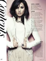

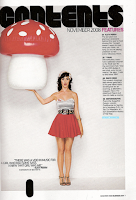
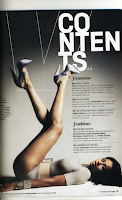
- Main Image; The main image on the contents page is the most important story in the magazine. It is usually positioned in the middle or towards the side of the page. It is framed by the rest of the text.
- Issue number; Most of the time positioned in the top left or right corner of the contents page.
- Quotes; Sometimes contents pages have quotes from interviews they had done in the magazine. this helps to grab the audiences attention.Most of the time they are on the main image.
- Layout; The contents is laid out into 3 or 4 columns, they are to the side of the main image. They never overlap or cover the image.
- Font; Usually in size 11pt and big bold font of the ‘contents’ title in placed at the top.
- Front cover; In some contents pages they have a small copy of the magazine front cover, they put page numbers in circles to show which story is on which page. This makes it quicker for the audience to locate the page they want.
- Contents; Word is prominent, it lets the audience know it is actually the contents page where they can find out more details. Written in bold, capitals, also the colour (white) contrasts against the black background. This makes it stand out to the audience.


No comments:
Post a Comment