
My contents page for my preliminary production was very basic and looked a bit like front page. my teacher commented on my product saying it looks like a front magazine content page to get a better understanding of how a content page looks like I looked at codes and conventions of content pages from real magazines on the market. I made a list of the conventions so that i can follow them on my final music magazine . As a result the music magazine content page looks like a content page , thus avoiding any confusion to my target audience.
in my content page there wasn't very good positioning in the overall composition. I used grids on my main task to split the sections of my magazine. This worked well and I could create a clean and easy to read contents page.
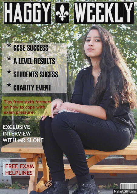
During my main task I edited all of my images and made them link with my social class and genre. I did much more research on the background of the genre.
My preliminary task was very basic in terms of typography and images. I used the same basic font throughout my preliminary task. However in my main task I experimented with different fonts to make my page look much more attractive which appeals to my audience.
Another main feature which differs the two productions is the use of images, I took basic images around college for the first task but in my main task I used image from different areas to appeal to my target audience and genre. i also trying different lighting to increase the quality of my images.
In my first task I missed out generic features of music magazines such as bar-code, this created a very unprofessional touch to the magazine. So in adding small features like this, it enabled me to create a better and more professional look.


